When sitting in front of a chart, traders are able to observe patterns that the rest of us would never be able to detect. Based on learning concepts such as Golden Cross and Death Cross patterns, traders deploy their art when it comes to trading assets.
The crypto ecosystem has its own particularities. It is still an extremely small market, with levels of volatility rarely seen and a constant suspicion of manipulation. However, in times of “normal” movements, patterns repeat themselves over and over again.
Both concepts, the Golden Cross and the Death Cross, are patterns that are analyzed with respect to the moving averages, and that indicate potential trend changes, in both directions, of the market in which we are located. In this article, I tell you what you should know about both.
Golden Cross and Death Cross patterns
In short, a Golden Cross, which we could translate as “Golden Cross”, is a chart pattern consisting of a short term moving average crossing, or crossing, hence the name, up a long term moving average.
A Death Cross, on the other hand, involves a crossing of a short-term moving average below a long-term moving average. Both patterns are used as relatively reliable tools for the purpose of confirming long-term trend changes.
Now, before continuing with the analysis of these widely used “chart patterns” and unpacking the brief definitions I have given, it is necessary that we take the time to make a few clarifications.
What are moving averages?
Both the Golden Cross and the Death Cross are patterns that are contrasted with moving averages. But, do we know what a moving average is? Perhaps, you are not familiar with this concept, that is why I will try to make it clear.
When we talk about a moving average, we refer to a line drawn on a chart that shows the price of an asset, and this is responsible for measuring the average price of this asset during a specific period of time, which the trader determines according to his needs and convenience.
Surely any trader could confirm that the most used types of moving averages are those of 50, 100 and 200 days. This means that, after taking the period we believe necessary for our research, a moving average will give us the average price of the asset in question, during the selected analysis period.
Just for the sake of completeness, there are two types of moving averages, those called simple and exponential. In any case, for the purpose of understanding this article, it is worthwhile to get the idea that moving averages are intended to provide clarity when observing the chart of an asset. The tracing of these lines allows us to identify in a simple way, the trend of the price we are analyzing and this is its greatest virtue.
Now, once and for all, it is time to fully unravel these concepts and get hold of these chart patterns that will give us a hand when analyzing trend changes in an asset we are analyzing and become more complete traders.
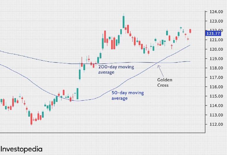
What is the Golden Cross?
As I anticipated in the introduction of this article, we are in front of a Golden Cross when we find that a short-term moving average crosses upwards a long-term moving average.
It is very common for the short-term moving average to be a 50-day moving average, while a 200-day moving average is in charge of setting the long-term trend. In any case, we are only talking about habituality here, since trading always depends on the observer’s eyes and the timeframes he/she decides to consider. As long as the crossover is executed upwards by a short term moving average, which breaks a long term moving average, we will be in front of a Golden Cross.
This phenomenon usually has three clear and differentiable stages:
- First, we are in a downtrend, during which the short-term moving average is below the long-term moving average.
- Then, the “Golden Cross” bursts before our eyes, when the short term moving average crosses, upwards, the long term moving average.
- After this event, we are facing an upward trend, in which the short term moving average remains above the long term moving average.
We could take the third point as the confirmation that a Golden Cross has taken place. If this situation is sustained, the change of trend from bearish to bullish will be confirmed.
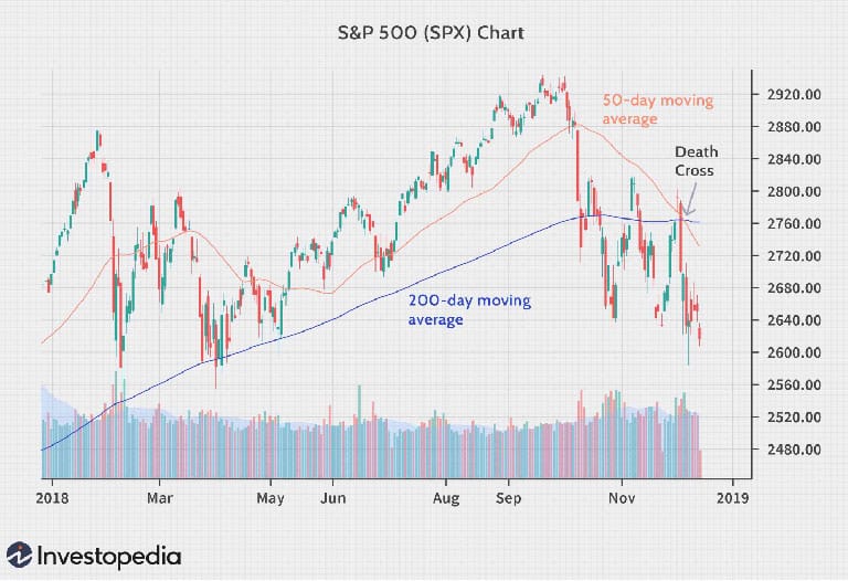
What is the Death Cross?
By virtue of what was related in the first section of this article, added to the, countless times well weighted, common sense, you can imagine that a Death Cross, will be exactly the opposite movement to a Golden Cross.
This chart pattern presents us with the opposite situation. In this pattern, a short term moving average crosses a long term moving average, but it does it in the opposite direction, downwards. As in the Golden Cross, 50-day moving averages, such as the short term one, and the 200-day one, such as the long term one, are usually used to detect a Death Cross.
It is obvious that when a Death Cross occurs and is confirmed on a chart, the trend change will go from bullish to bearish.
Let’s review the stages through which we go from the beginning to the confirmation of a Death Cross:
- Initially, the short term moving average moves above the long term moving average. Here we are in an uptrend
- Then, the short term moving average crosses down the long term moving average and the trend is reversed.
- Once the short-term moving average remains below the long-term moving average, we confirm the beginning of the downtrend.
Again, point three is confirmation that we have witnessed a Death Cross and, also validation that we have lost the uptrend, and it will be the bears who celebrate the move to a downtrend.
How to operate the Golden Cross and Death Cross?
As we have seen, these are two fairly simple and intuitive patterns. Thus, trading based on them is, in the same way, relatively simple. Let’s see how these patterns can help us when managing our capital. It is not superfluous to clarify that far from the objective of this article is to give any kind of financial advice, as always we are simply sharing information about the tools and concepts related to the crypto-world.
It is usual, that those who operate with these patterns, do it on daily time frame charts. In this sense, a simple strategy widely used is:
- Acquire the asset in question once we observe a Golden Cross
- Detach this asset once we encounter a Death Cross.
This simple way of trading, according to these chart patterns, has been quite successful. Of course, there is a risk of false signals. Here I refer to the fact of observing a crossover of moving averages, but that it is not sustained over time and the trend is not reversed.
In short, once again we are faced with the reality that tells us that we cannot blindly rely on a single indicator, pattern or signal that we consider. It is necessary to have different tools that allow us to make reasoned decisions, within the temporalities in which we wish to intervene. In any case, these chart patterns are still of great help when analyzing trends and detecting their changes or reversals.
Conclusion and final words
Once again, we have taken a quick look at the tools and concepts that traders have at hand when it comes to trading assets, observing charts and determining what the next move of “the candle on the right” will be, their great obsession.
When making their estimates, based on what has happened in the past, many crypto-users downplay the importance of trading tools. While some consider it a field of science, others see it as a kind of art and its detractors qualify as necromancers those who habitually make use of this practice, stripping it of any possible real validity.
From my humble point of view, I consider that all the tools that we have available at our fingertips, and that add to the necessary analysis when making decisions about our capital, are welcome.