Origin of the bitcoin logo

Tiempo de lectura: 7 minutos

Origin of the bitcoin logo

Today I want to tell you a very curious and interesting story that has as its protagonist the logo of the first and most important cryptocurrency in history: the BITCOIN.

Perhaps you have never wondered what is hidden behind this orange circle and today I will reveal how one of the most famous and globally recognized symbols was created. Join me to discover the origin of the bitcoin logo.

History and evolution of the bitcoin logo

Origen del logo de Bitcoin Bitnovo

You may be surprised to know, but what we know today as the capital “B”, bitcoin’s symbol, was not used in the original versions. Below I will tell you about the evolution of the BTC logo.

FIRST VERSION: SATOSHI NAKAMOTO (EARLY 2009)

Satoshi Nakamoto, who was a crypto and computer cracker, surely didn’t shine in graphic design (you can’t have everything in life 😜).

In fact the first (very spartan) logo they released in 2009 was a circle with the letters “BC”.

primer logo de bitcoin Bitnovo

Satoshi Nakamoto’s Bitcoin logo appeared two years after the launch of Apple’s iPhone, whose user interface was largely based on skeumorphic design, just like the Bitcoin logo. Scheumorphism, from the Greek skeuos (meaning tool) and morphê (meaning shape), is a design technique in which an element maintains certain aspects that remind us of objects present in real life and is a style that was very fashionable at the time of bitcoin’s launch.

logo bitcoin en bitcointalk Bitnovo

SECOND RELEASE: BITCOIN TALK (FEBRUARY 24, 2010)

The following year, when the Bitcointalk forum had already arrived and it was clear that Nakamoto’s project was going to be successful, the desire for a new symbol, more similar to other monetary icons, became more and more impelling.

Thus forum users began to join Nakamoto’s conversation about the Bitcoin logo.

Several participants in the discussion also presented various ideas.

Some suggested using the Thai baht symbol (฿), others advocated the ampersand (&), someone suggested adding a “T” to “BC” and others recommended using the initials “BTC” as the official currency code.

Nakamoto himself, listening to the various proposals and eager to create a new identity to what would be the first crypto and one of the most important symbols in history, proposed a new version of the logo, which he published on BitcoinTalk on February 24, 2010 and had to represent a coin equivalent to 100 million satoshis.

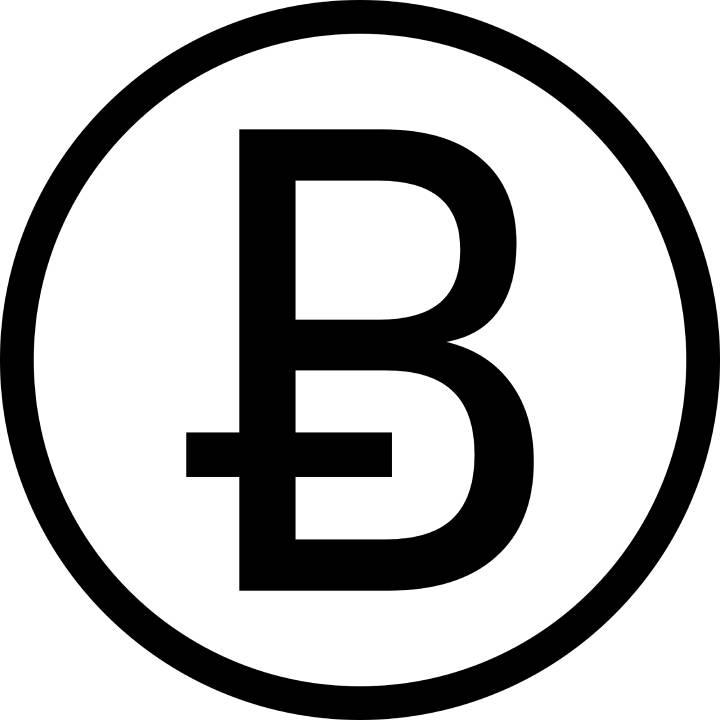
The second version of the logo followed the Thai baht concept, a letter “B” with two vertical strokes.

bitcoin logo sgunda version Bitnovo

This proposal, while not a masterpiece in terms of design, was interesting in light of the comments that Hal Finney, who years later many thought was the real Satoshi Nakamoto, posted on BitcoinTalk.

Bitcoin Symbol

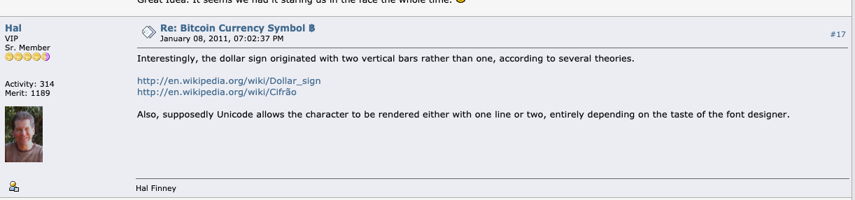
“Interestingly, the dollar sign originated with two vertical bars instead of one, according to several theories.

http://en.wikipedia.org/wiki/Dollar_sign

http://en.wikipedia.org/wiki/Cifrão

In addition, Unicode supposedly allows the character to be represented with one or two lines, depending on the font designer’s taste.”

Well, notwithstanding Satoshi’s effort, many users had no qualms about criticizing the new logo version… sometimes in a quite direct and insistent manner 😆.

An example is user ArrowJ who wrote:

“Is this the “official” logo? I understand how hard it can be to do something truly professional when you don’t have the skills (which I don’t have) or the software (which I also don’t have), so I’m not trying to be rude, but wouldn’t it be better if we adopted something … better? I’m really not trying to be mean…. I’ve really done my best to try to figure out how to do the things that many of the Deviant artists do.

There is at least one other thread with a set of logos and badges that are really promising here: http://bitcointalk.org/index.php?topic=1631.0 

I promise I don’t know this guy (I didn’t even check the username). What the heck, if anyone else could come up with another alternative that would be great too. It seems important that we have a really nice logo with all sizes, resolutions and formats that may be needed.

And insisted… 😬

Is there a reason we couldn’t adopt something else before Bitcoin gets too big and it’s too late to change without damaging “brand” recognition? It seems silly to stick with something that is “fine” when we could have something great.

I hope I didn’t step on anyone’s toes too much.”

THIRD VERSION: BITBOY (NOVEMBER 2010)

After several proposals and opinions, Bitcointalk users unanimously thought that the symbol should conform to certain characteristics that would have allowed anyone to use it in any size and proportions and fit any medium, thus ensuring its fungibility. And it was in November 2010 that a user named Bitboy left his first message on Bitcointalk, humbly sharing some of the graphics he had designed.

The comments from other users were surprisingly positive but no one would have thought that the logo proposed and created by Bitboy would have been the logo of the most important digital currency in history.

bitcoin logo bitboy bitcointalk Bitnovo

Bitboy used the “B” symbol that Satoshi had previously designed, rendered it in white and placed it in an orange circle, tilting the ฿ symbol to the right.

Some Bitcoinktalk users noted that Bitboy’s design was somewhat similar to that of the famous Mastercard brand and Bitboy replied that, although he was not a lover of Visa and Mastercard, these brands had undoubtedly been his inspiration.

This was undoubtedly the first impetus for defining bitcoin as a payment method.

Bitboy’s graphics were freely downloadable and placed in a public domain.

Controversies and new Bitcoin logo proposals

April 2014

Despite being very well received by the community, not everyone agreed with Bitboy’s bitcoin logo.

Some, like those behind the bitcoinsymbol.org movement, launched a campaign to promote their version of the logo and were active for years with the intention of changing it, firmly believing that the Bitcoin symbol should not look like a logo and should be more like a currency symbol (such as the dollar, euro or yen).

The same bitcoinsymbol.org users in April 2014, proposed the adoption of this Ƀ sign that already exists in the Unicode Character U+0243 and in many alphabets, including Latin.

bitcoin symbol movimiento 2014 Bitnovo

The bitcoinsymbol.org community argued for such a proposal on its website explaining that:

“As a widely distributed peer-to-peer digital currency, Bitcoin needs an open source graphic identity, designed with open source software by and for the community. It needs to be as minimal as possible to allow for more customizations. Because it is simple, extensible, and evergreen, it meets all those requirements.”

October 31, 2016

In the following years, the controversies did not cease.

In the fall of 2016, Phil Wilson (known as Scronty) took to Reddit, claiming that he was one of three people behind the pseudonym Satoshi Nakamoto.

And, regarding the bitcoin logo, Wilson posted on his Medium pageinstructions on how to build both the Satoshi-designed gold coin logo and the Bitboy logos, which he said he collaborated with.

Meaning and symbolism behind the Bitcoin logo

If we look closely at the Bitcoin logo, we can better understand the mathematical reasoning behind it, which Wilson explains in his medium article.

Number 8

A first symbolism is represented by the number 8. And it is that this number appears several times in the dimensions and geometry of the Bitcoin design (for example, the B rotates clockwise 13.88 degrees). Always according to Wilson, an eight looks like a B, which is short for “Block”. The dimensions of other shapes (such as the rectangles in the design) had a length of 12.5 (or one-eighth of 100, again representing an eight).

The two vertical strokes that make up the B

What is the meaning of these two lines? Well, first of all they are supposed to evoke the U.S. dollar. But, if you look closely, you will notice that they can only be seen above and below the “B” and do not cross the entire letter, as is the case with the dollar.

In fact it seems that the “B” has been placed over the “$” symbol, as if to symbolize that the old international currency, the dollar, has been replaced by Bitcoin.

Orange circle: the secret of the universe

In the logo, the orange circle is scaled to 525 percent to give it a precise diameter. According to Wilson, “525% is 12.5 x 42,” or one-eighth of 100 times 42, representing the secret of the universe.

This is a reference to the book “The Hitchhiker’s Guide to the Galaxy,” since “This technology is supposed to be the answer to the fundamental question of life, the universe and everything,” Wilson explained.

Font

The Trebuchet font used in the logo was inspired by the trebuchet catapult, which was Wilson’s favorite weapon in the “Age of Empires” video game.

Color

For the circle, orange (hex code # F6911D, Pantone 1495 C) was chosen for a practical and aesthetic purpose. Wilson stated that a color was chosen that could be printed and replicated “both on websites and in print media” and that could stand out among other payment options and currencies. In addition, the orange color seems to evoke gold.

Bitcoin logo today

In 2011, there was the first unsuccessful attempt to include the bitcoin sign in the Unicode system. Finally, at the end of 2015, bitcoin was officially registered and received its symbol in the Unicode 10.0 standard.

Today bitcoin has supported fonts in a variety of software versions.

In February 2019, Google added a variant of Bitboy’s Bitcoin token to its mobile keyboards.

A year later Twitter added a Bitcoin emoji to the #bitcoin hashtag.

Today, it seems that the Bitcoin logo has become one of the most popular symbols, also among those who do not know what Bitcoin is.

A Google search suggests that bitcoin products and merchandising has reached incredible levels in online sales so much so that there are over 249,000,000 million results for the search term “bitcoin products” and 82 million results for the term “bitcoin shirt”.


Leave a comment
Your email address will not be published. Required fields are marked *